On The Roll
On The Roll
For this project we were to design a Kitsch type project. We had to think of three different ideas that fall into Kitsch category. Products that are tacky or work in a different way than what it appears. We had to design packaging using either 4 spot or process color and could only be printed on one side of a piece of paper with at least one window. The type of box used for packaging was left up to us to decide, but had to be all one piece, there could not be two separate pieces for the box. We were given the parent company name, phone number, and physical and web address. UPC Code, warning, size, and weight were required. Nutrition label and ingredients, best if used by and any other copy if needed.
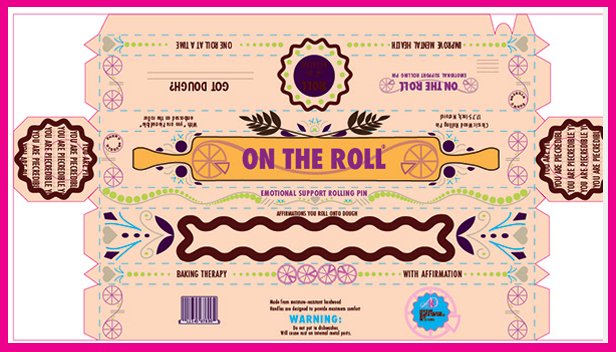
On The Roll is a kitsch product that lifts you with color and supports you emotionally with positive affirmation while reminding you that rolling out dough is hard work!
Design Process
Sketches & Doodles
I had some rough sketches in the research and brainstorming for other ideas that I had. For the three I settled on, a box for and apron, an air freshener, a rolling pin. Each had a lot of illustration going on, of course it’s a kitsch project.
Intermediates
I moved forward with the apron and the rolling pin as these two had the most of the design figured out. Also I had the windows figured out on both of these and the figurine I didn't. For the apron I had repeated pattern that went around all four sides that I really liked, but struggled with keeping the box closed. With the rolling pin, I want to go with lots of lines, circles and hearts which works well on pastry items.
Research & Brainstorming
Finding Kitsch wasn't really hard to find. Finding an idea that wasn't already being used was the hard part. It was fun looking at what was out there, I got a good laugh. At first my ideas were based on things that I would like to see out there but were not really kitschy enough. My three ideas are on the tame side and little ridiculous.
Final Hand
I moved forward with the rolling pin as it did have the most design figured out. I especially liked how I was able to make the ends look like a pie with the writing on them. I still had some empty space to fill in but I felt I had most everything I needed to move forward.
Color Studies
Since it's a rolling pin for pie dough I felt I needed to go with more rich colors but I found going with the colors not really associated with pie dough or rolling pins made it pop out better. I tried to keep the like shapes the same colors. I also made a pie silhouette for the background but took it off as I felt it distracted from the rest. I liked all the colors and it was hard to choose one. I wasn't this far in the work to get advise from the class. I just lined them up and went with the one that looked the best for me.


