Juicies: Curly Q's
Juicies: Curly Q's
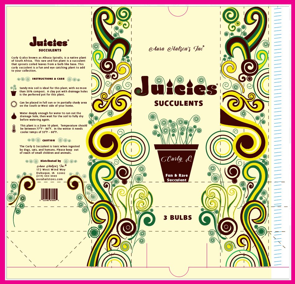
Objective: to design a layout for a tin tie bag. The product is a flower or plant bulb. It is a three color spot and were to get the measurements from an existing bag. The parent company name, address, phone and website was provided. We were to come up with the product name and choose what type of bulb we were going to design around.
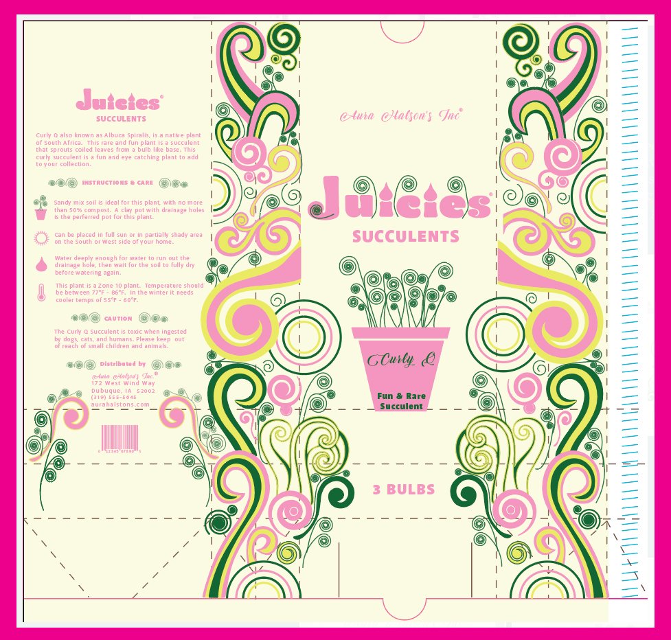
The design for this tin tie bag for Juicies fun and rare succulent bulbs is whimsicle just like the plant when it grows. Rightfully named Curly Q’s the design and the plant share the spiraling shapes that make them unique. The color scheme displays the fun that comes with admiring these plants while in full bloom.
Design Process
Sketches & Doodles
I didn't really do a lot of doodles as I jotted down sketches quickly in templates that I made. I really tried to focus a lot on the side panels using different patterns. I soon began to realized that the back panels, with all the information, was going to look a lot alike with each of the layouts. I only sketched out three layouts and left the rest blank. I sketched out the fronts and two side panels.
Intermediates
Moving forward I went with Jucies Succulents and Aromatics Leeks. I really liked both these layout designs, they each had good areas of illustration. I wanted to step out of my comfort zone of keeping it simple and wanted to put a lot swirly chaos on it.
Research & Brainstorming
I researched all the different types of bag packaging. Really looking close at the design of the layout. I got a coffee bag to get measurements from to start to build my template from it. I also researched many different flower and vegetables. I found a few succulents that grow from a bulb and used that as one of my three types of bulbs.
Final Hand
I moved forward with Jucies Succulents as this layout was my favorite of the two. I also like the swirls and curls all over. I wanted to make some kind of pattern background at a very light opacity but thought against it, there is a lot going on to begin with all the swirls.
Color Studies
I knew I wanted to have some shade of green in each pallet. The green had to be there as it wouldn't look right if the plant was made into a purple. It would give the impression that the plant was purple and it is not purple. It was hard to pick one as I really like all of the color pallets here. I felt the pink color pallet spoke to the word Juicies more then the rest of the color pallets. I moved forward with the pink, yellow and green color pallet.


